What happens when one bank merges with two other financial institutions, but they all need to keep their individuality?
Countless experiments and revisions, for one thing.
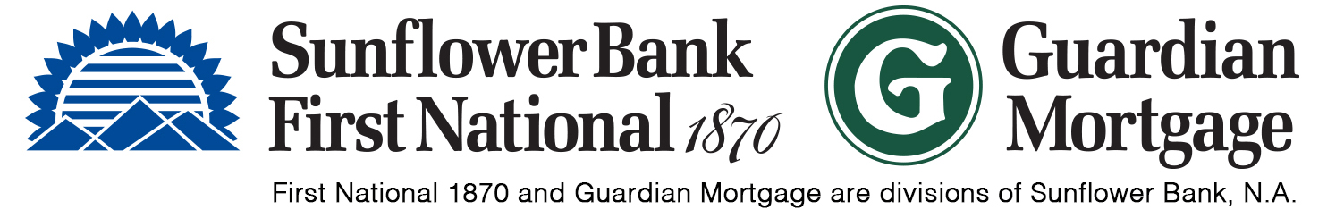
In recent years, Sunflower Bank merged with First National 1870 and Guardian Mortgage. Despite being legally linked, each needed to remain recognizable to its current customers.
Even before the merger, there was interest in updating the Sunflower Bank logo. It was designed in the 80s, and by the time I began working with the bank, it had already been revised several times. The options I presented used the existing color scheme and font, eliminated the yellow/red gradient (which was often difficult to print), and removed the blue enclosure. Here’s what I presented, but none of these were used.
Then came the merger. Here are the original three logos from each of the banks.
I pushed for a single identity that could incorporate aspects of each institution, but since the client wanted to maintain the equity built up within each of the names, that idea was rejected. So we needed to find a way to create a blended identity that allowed each bank to maintain its individuality. I won’t go into all the behind-the-scenes information that governed what could and couldn’t be done. Suffice to say, we pursued many different directions, and we progressed in stages. I designed dozens of variations and permutations. Here’s one of the interim versions that was used.
One version of the final design appears below. It checks all the necessary boxes: font consistency, versatility in arrangement, and relative simplicity in design. The logos have to work together and separately, accommodate both horizontal and vertical layouts, and must include the disclosure indicating ownership. Sometimes practicality is the best form of creativity.