Wednesday, December 8, 2021

Sprinkle a little sunshine.


A local farmer’s market merchant needed a logo for her seed and nut mixture called Susie’s Sprinkles. Sue brought a lot of ideas to the table when we met. We brainstormed for a while, looking at various designs styles, typefaces, and color combinations. Then I went to work and created three unique looks for her company. She was particularly interested in the one that used the big monogram S, so that’s what we went with. After some back-and-forth with changes in color and details, here’s the result.

You can find Susie’s Sprinkles on Facebook.

Thursday, December 2, 2021

I love graphite — come matt or shine.

faber castell matt graphite pencils

A complaint I often hear about graphite is that you can’t get really dark darks without also getting shine. So I was eager to try the new Faber Castell matt graphite pencils.

I ordered the set of 12 (though I see now all Amazon has is a set of 6) which had from HB through 14B. The 14B got plenty dark, and there really ISN’T much of a shine. As the pencils progress in darkness, they increase in carbon content, rather than graphite. The carbon keeps them from producing a shine. You can see in my drawing of the leaves that the shadows are pretty dark, and there’s no shine. It also lifts up well with a kneaded eraser, as long as you haven’t been too heavy-handed when laying down the shadows. 

I’ve read mixed reviews from other people. To me, they handled a lot like Prismacolor pencils. Not a bad thing, but different from regular graphite. 

Friday, November 26, 2021

Marian Bantjes — contemporary designer/artist/letterer.

marian bantjes christmas card
Marian Bantjes is known for her obsessive patterning and ornament, whether hand-drawn or created digitally. This design was one of three holiday cards she did for Amorial Paris. It reminds me of how much fun I had with my Spirograph when I was a kid. But I never could keep my pen from jumping around the teeth of the plastic gears!

I bought Marian’s book, I Wonder, several years ago. It is a feast for the eyes, and also presents her ideas about the importance of the practical side of commercial projects, as opposed to the aesthetic qualities.

Tuesday, November 23, 2021

Hallmark & Dalî?

salvador dali christmas cards for hallmark

For Christmas 1960, Hallmark commissioned Salvador Dalí to design some holiday greeting cards. It was an initiative led by Hallmark founder Joyce Clyde Hall to show the work of great artists to people who might not otherwise see it.

Dali asked for $15,000 in cash in advance for 10 card designs, specifying that he receive no input from Hallmark on subject or medium, no deadline, and no royalties. His designs included “Surrealist renditions of the Christmas tree and the Holy Family,” as well as a headless angel playing a lute, and the three wise men atop some wild-looking camels.

Hallmark only produced two of the designs, a nativity scene and a depiction of the Madonna and Child. Even those relatively tame images didn’t go over well, and negative public response soon convinced Hallmark to drop Dalí’s cards from their product line.

You might not be able to get Hallmark Christmas cards by Dalí, but you CAN get a Dalí ornament made from Polish blown glass

Alexander Girard — then and now.

alexander girard christmas card

Architect and designer Alexander Girard was extremely prolific during the 1960s and 1970s. I bet you’d recognize his work — take a look at this excellent video from a recent episode of CBS Sunday Morning (under 5 minutes long). This Christmas card an example of his skill with typography and lettering (his font, Sansusie, is one of my favs). He’s very much back in vogue: Girard’s family is reintroducing him to new generations with this website, House Industries is selling a wooden Alexander Girard Nativity based on his characters (update: nativity is no longer available), and there’s even an Alexander Girard coloring book!

Sunday, November 21, 2021

More holiday inspiration from great designers.

paul rand christmas card

Continuing with the theme of classic holiday cards I found while looking for inspiration for my own clients’ projects this year, here’s one from Paul Rand designed in the 1960s. I wish I would have thought of this for an assignment when I was teaching commercial art: design a holiday card inspired by an indoor sport. Such a smart design!

Saturday, November 20, 2021

Holiday card inspiration from the greats.

milton glaser christmas card

While designing Christmas cards for clients, I’ve been looking at past examples from some of my favorite designers/illustrators. Here’s a 1960s card from Milton Glaser (my all-time favorite), created for a typography company called Advertising Composition. He fashioned a Christmas tree from the type settings of its catalog. Anyone remember the days of type-specking?

BTW, Milton’s book Drawing is Thinking is an excellent ‘read’ (if you can call it ‘reading’) and demonstrates his idea that drawing is not just a way to represent reality, but a way to understand and experience the world.

Friday, November 12, 2021

All roads lead to Rome.

 st peter's basilica

I can’t resist posting this drawing of St. Peter’s Basilica in Rome from my sketchbook, because tomorrow is one of the last classes for my Smithsonian World Art History certificate and the subject is Italian architecture. I drew this during a previous Smithsonian class using Pigma Micron pens in a variety of sizes. These pens wear out kind of fast, but they’re waterproof so I can add color.

I wish I had drawn it from life, but alas, no.

Wednesday, November 10, 2021

A poppy for Veteran’s Day.

poppy illustration for veteran's day

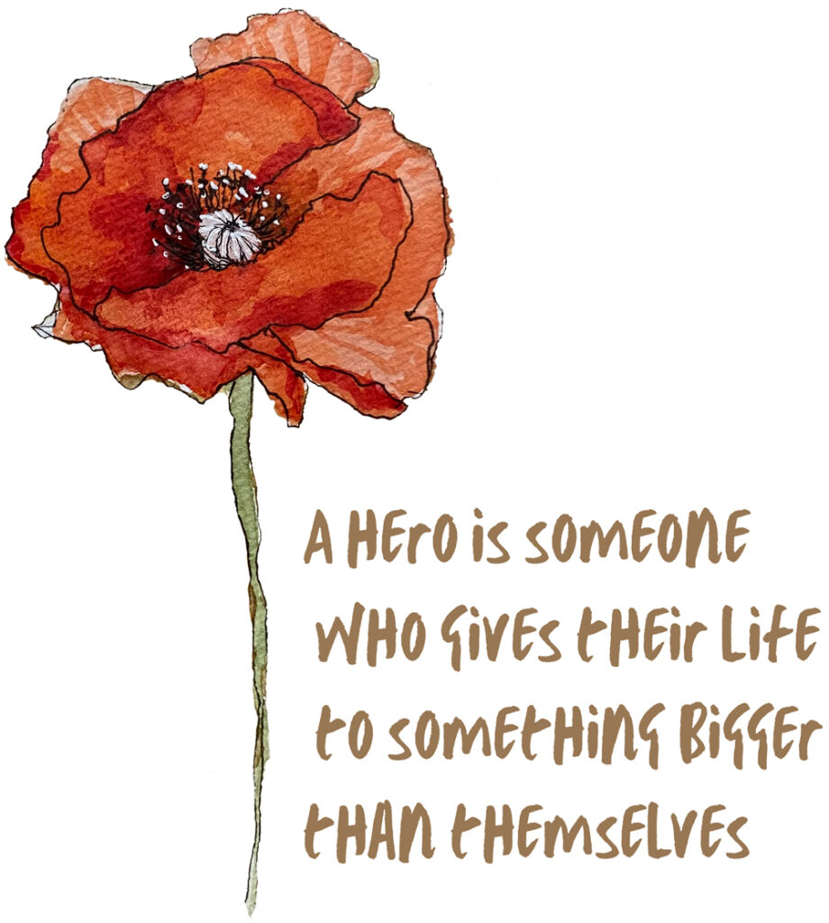
Tomorrow is Veteran’s Day, and we’ll probably see a lot of poppies as a symbol of remembrance. Here’s a little illustration of a poppy I did in my sketchbook a while back, and some info about how that tradition got started.

From The Poppy Story on the American Legion’s website: “After World War I, the poppy flourished in Europe. Scientists attributed the growth to soils in France and Belgium becoming enriched with lime from the rubble left by the war. From the dirt and mud grew a beautiful red poppy. The red poppy came to symbolize the bloodshed during battle following the publication of the wartime poem “In Flanders Fields.”

You can read more about The Poppy Story on the American Legion’s website, where you can also download a poster of “In Flanders Fields.” And here’s a sweatshirt featuring my illustration.

In Flanders Fields
By John McCrae

In Flanders fields the poppies blow

Between the crosses, row on row,

    That mark our place; and in the sky

    The larks, still bravely singing, fly

Scarce heard amid the guns below.

We are the Dead. Short days ago

We lived, felt dawn, saw sunset glow,

    Loved and were loved, and now we lie,

        In Flanders fields.

Take up our quarrel with the foe:

To you from failing hands we throw

    The torch; be yours to hold it high.

    If ye break faith with us who die

We shall not sleep, though poppies grow

        In Flanders fields.

Unique holiday greetings make an impression!

PHD client christmas cards

Make this season even more special by sending custom holiday cards to your clients and customers. It’s a thoughtful way to let people know you value their business.

I’m currently finishing up several customized greetings cards and letters for clients, but I think there’s time to squeeze in at least a couple more!

Ready to get started or have questions? Just send me a message here.

Wishing you a happy holiday season!

Sunday, November 7, 2021

Art history.

brunelleschi's basilica
Art History has been a longtime fascination of mine, in particular, the Renaissance. I took my first real Art History classes not so long ago (thank you Brad Anderson) and I’m always looking for ways to learn more. About a year ago, I ran across the Smithsonian Art History certificate program. I enrolled and now am almost finished with the course. One of the best discoveries has been Rocky Ruggiero, a frequent lecturer for the Smithsonian. He’s passionate about the Italian Renaissance and is quite entertaining. He also has a podcast, a YouTube channel, and plenty of programs of all sorts available on his website (a future fantasy is that after-hours trip to the Sistine Chapel!). Just today I ran across his book, which I promptly ordered and will devour once it arrives!

Thursday, November 4, 2021

The Feelings Umbrella

The Feelings Umbrella
LaNay Meier is a retired mental health nurse who saw many people in pain throughout her career. She developed a concept that she thought could help people process their feelings in a healthy way — a ‘feelings umbrella.’

She wanted to create a book to help get this message across to children, so they could avoid the unfortunate situations that result from an inability to cope with emotions.

She asked for my help in putting the book together. Many friends and professionals helped to clarify the concept and message. Then I designed the book, using stock images which I revised to fit the story.

The result is The Feelings Umbrella, available here.

Tuesday, November 2, 2021

A bookish bombshell.

A Bookish Bombshell

My collages often tell a story, but I don’t know what the story is until the piece is well underway. In this case, I started with a vintage dictionary page as a background, then began rummaging through my collection of ephemera and other odds and ends.

If the collage seems to need a particular item and I don’t have an image that works, I’ll draw or paint what I want. For this mid-century woman, I used colored pencil to draw some snazzy cat-eye glasses so that she could see her world more clearly — and read the dictionary page.

I made up a story about her as the piece came together, but I hope viewers are inspired to make up their own: who’s the woman, what did she see with her glasses, did she have a special relationship to any other of the ‘B’ words on the page?

A Bookish Bombshell was created for the Lincoln Art Center’s Book It show.

Monday, November 1, 2021

Forgotten art supplies.

rototray
I wish I had kept the red roto-tray that I had years ago. Apparently, they’re now a collector’s item, shown here at the Museum of Forgotten Art Supplies. There are a LOT of fascinating items on that Museum website! If you were a graphic designer, commercial artist, draftsman, or architect in the mid-twentieth century, I bet a lot of them bring back memories.

I’m currently using a black version of the roto-tray, not a vintage as the red one, and short pencils still get lost down in the holes. This is its current state, drawn with my favorite pen, a Pilot G2 gel pen in black. Only one problem, it’s not waterproof.

Who's your inspiration?

inspiring creators

Every Monday I get an email newsletter from painter Bob Burridge, which includes a link to one of his YouTube videos that he calls BobBlasts. They’re usually demonstrations of his technique, which is always loose and colorful and kinda wild. But this week’s BobBlast was about inspiration. He encouraged his viewers to think about who and what inspires them and use that inspiration for energy in their own work. It got me thinking: 

Bob Burridge is an inspiration to me. I admire his discipline and dedication to his work. David Hockney, too, for many of the same reasons. Hockney comes up with new ways to look at things and is not afraid to evolve and adopt new technology. In the design world, I’ve admired Paula Scher for years. She’s created some of the most iconic identity systems in the world, and always finds time to do her own personal projects. Check out her typographic maps

These are just a few of the people I find very inspiring, and they remind me to, as Austin Kleon (another inspiration) says, just keep going.

Saturday, October 9, 2021

Practice makes perfect.


The downside of a typical day for me is that it’s mostly spent staring at a computer screen. I do carry a sketchbook with me and frequently jot down details of my surroundings. But I love detailed drawing, and those kinds of projects don’t happen without conscious thought and planning.

Towards that end, a few friends and I have been meeting once a week to learn and practice lessons from the Bargue Drawing Course (here’s an economical alternative to the full course). It’s the way many art students in 19th-century European academies learned to draw.

The emphasis is on accuracy — no personal style or creative flair desired, just reproducing a set of lithographic plates exactly as they are; training the eye to see accurately. We use the sight-size method to get the measurements precise and then build the shading in layers to reproduce the effect we see in the original. Results build s-l-o-w-l-y. We spent hours copying a small preliminary sketch of an eye, getting every line placed at just the right angle in just the right spot. After 18 hours(!), I’ve done an eye, a bust of a man in profile, a hand (not finished), and next week will start on a sculpture of a torso. I’ll have 9 hours to finish that, then we’re taking a break for the holidays.

It’s been such fun to spend time with friends who are also interested in this style of drawing. We’re in good company: Van Gogh used the course to strengthen his drawing skills when he couldn’t make it as a student in a traditional academy. Bargue drawings aren’t meant to be an end in themselves, but a way to develop skills that I can use to improve other drawings.

Sunday, February 21, 2021

Meatball or worm?


As I watched yesterday’s thrilling landing of Perseverance on the surface of Mars, I couldn’t help but notice the big round NASA logo on the wall — the ‘meatball.’ Do you remember the NASA ‘worm’ logo? It was designed in 1975 by Bruce Blackburn (he just died earlier this month).


Blackburn’s design quickly became a symbol of the space age and the promising future that lay ahead. “The less you can do with the most effect, that’s the thing you want to do,” is how Blackburn described his process. He used a simple combination of lines, curved, and circle fragments to create the iconic design. Upon seeing the new design, a chief administrator of NASA reportedly said, “Where’s the cross strokes in the A’s? Feels like we’re not getting our money’s worth.”

After the Challenger accident in 1986 and other morale-deflating incidents at NASA, the decision was made to bring back the meatball. There was an uproar in the design community. Blackburn had not only designed the logo, but an extensive Graphic Standards Manual — a stellar example of information design in and of itself — and now all that would be rendered useless.
But, such is the way of the world. At least appears that the Mars Rover 2020 logo pays homage to Blackburn’s work.

Monday, January 18, 2021

Does your business image need a facelift? Or maybe just a little nip-and-tuck?


I design expressive and effective logos for companies of all sizes. Let’s talk about giving your business a fresh new look in 2021, with either a complete branding strategy including a new logo, or an update of your current business image. Send me a message today and we’ll get started!