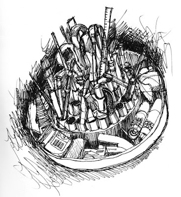
I’m currently using a black version of the roto-tray, not a vintage as the red one, and short pencils still get lost down in the holes. This is its current state, drawn with my favorite pen, a Pilot G2 gel pen in black. Only one problem, it’s not waterproof.
Monday, November 1, 2021
Forgotten art supplies.
Who's your inspiration?
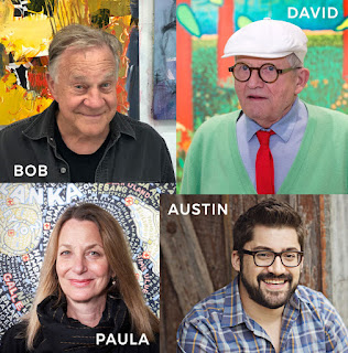
Every Monday I get an email newsletter from painter Bob Burridge, which includes a link to one of his YouTube videos that he calls BobBlasts. They’re usually demonstrations of his technique, which is always loose and colorful and kinda wild. But this week’s BobBlast was about inspiration. He encouraged his viewers to think about who and what inspires them and use that inspiration for energy in their own work. It got me thinking:
Bob Burridge is an inspiration to me. I admire his discipline and dedication to his work. David Hockney, too, for many of the same reasons. Hockney comes up with new ways to look at things and is not afraid to evolve and adopt new technology. In the design world, I’ve admired Paula Scher for years. She’s created some of the most iconic identity systems in the world, and always finds time to do her own personal projects. Check out her typographic maps.
These are just a few of the people I find very inspiring, and they remind me to, as Austin Kleon (another inspiration) says, just keep going.
Saturday, October 9, 2021
Practice makes perfect.
The downside of a typical day for me is that it’s mostly spent staring at a computer screen. I do carry a sketchbook with me and frequently jot down details of my surroundings. But I love detailed drawing, and those kinds of projects don’t happen without conscious thought and planning.
Towards that end, a few friends and I have been meeting once a week to learn and practice lessons from the Bargue Drawing Course (here’s an economical alternative to the full course). It’s the way many art students in 19th-century European academies learned to draw.
The emphasis is on accuracy — no personal style or creative flair desired, just reproducing a set of lithographic plates exactly as they are; training the eye to see accurately. We use the sight-size method to get the measurements precise and then build the shading in layers to reproduce the effect we see in the original. Results build s-l-o-w-l-y. We spent hours copying a small preliminary sketch of an eye, getting every line placed at just the right angle in just the right spot. After 18 hours(!), I’ve done an eye, a bust of a man in profile, a hand (not finished), and next week will start on a sculpture of a torso. I’ll have 9 hours to finish that, then we’re taking a break for the holidays.
It’s been such fun to spend time with friends who are also interested in this style of drawing. We’re in good company: Van Gogh used the course to strengthen his drawing skills when he couldn’t make it as a student in a traditional academy. Bargue drawings aren’t meant to be an end in themselves, but a way to develop skills that I can use to improve other drawings.
Sunday, February 21, 2021
Meatball or worm?
As I watched yesterday’s thrilling landing of Perseverance on the surface of Mars, I couldn’t help but notice the big round NASA logo on the wall — the ‘meatball.’ Do you remember the NASA ‘worm’ logo? It was designed in 1975 by Bruce Blackburn (he just died earlier this month).
Blackburn’s design quickly became a symbol of the space age and the promising future that lay ahead. “The less you can do with the most effect, that’s the thing you want to do,” is how Blackburn described his process. He used a simple combination of lines, curved, and circle fragments to create the iconic design. Upon seeing the new design, a chief administrator of NASA reportedly said, “Where’s the cross strokes in the A’s? Feels like we’re not getting our money’s worth.”
Monday, January 18, 2021
Does your business image need a facelift? Or maybe just a little nip-and-tuck?
I design expressive and effective logos for companies of all sizes. Let’s talk about giving your business a fresh new look in 2021, with either a complete branding strategy including a new logo, or an update of your current business image. Send me a message today and we’ll get started!
Friday, November 22, 2019
Merging three logos into one identity.
What happens when one bank merges with two other financial institutions, but they all need to keep their individuality?
Countless experiments and revisions, for one thing.
In recent years, Sunflower Bank merged with First National 1870 and Guardian Mortgage. Despite being legally linked, each needed to remain recognizable to its current customers.
Even before the merger, there was interest in updating the Sunflower Bank logo. It was designed in the 80s, and by the time I began working with the bank, it had already been revised several times. The options I presented used the existing color scheme and font, eliminated the yellow/red gradient (which was often difficult to print), and removed the blue enclosure. Here’s what I presented, but none of these were used.
Then came the merger. Here are the original three logos from each of the banks.
Sunday, November 10, 2019
Grant through the years.
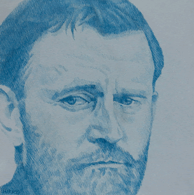
I’ve been listening to Ron Chernow’s epic biography of U.S. Grant on CD (38 CDs!). While listening, I drew these five portraits of the past President with a variety of pens from this set of plain ol’ Bic ballpoints.
The drawings were mounted on 8″ square wood panels and were displayed at the Sandzen Gallery holiday show.
Tuesday, August 6, 2019
Published!
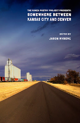 Thanks to Jason Ryberg of Spartan Press for including three pieces of my work in his new poetry anthology, Somewhere Between Kansas City and Denver.
There’s a book release party scheduled for August 22 from 6-9pm at SPARK in Downtown Salina. See more info about that here.
Thursday, March 26, 2015
I was reminded of him in a roundabout way after listening to a story about Steve Mumford, an artist who documented the Iraq War with drawings and paintings. Mumford’s Baghdad Journals are a moving account of the time he spent there. He was inspired by Winslow Homer’s documentation of the American Civil War.
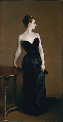
Hearing about Homer reminded me of John Singer Sargent’s work done after spending time at the Western Front in 1918. His large painting, Gassed, was completed during this time. Definitely a master.
Sunday, February 9, 2014
Friends, family, and fishing.
Thursday, January 9, 2014
A Dickensian Valentine.
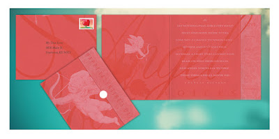
Here’s a self-mailing card (no envelope necessary, it comes with a round white sticker for closing) featuring original design and illustration to send to someone special.
The front of the card shows Cupid aiming his arrow, and the fold-over closing panel says ‘Happy Valentine’s Day.’ Inside Cupid appears again, and the panel on the right lists some qualities of love: patience, kindness, trust, hope, perseverance. Click on the image to see it enlarged.
The message is a lovely poem by Charles Dickens:
Let nothing pass, for every hand
Must find some work to do,
Lose not a chance to waken love —
Be firm and just and true.
So shall a light that cannot fade
Beam on thee from on high,
And angel voices say to thee —
These things shall never die.
A limited number are available. Let me know in the comments below if you're interested.
Thursday, April 11, 2013
Monday, April 8, 2013
Old bronze in gouache
Friday, April 5, 2013
Complex spices
This drawing was done in three sittings. It was still fun and gratifying to draw. I observed many things about my selection of spices that I didn't know before.

