Monday, January 18, 2021
Does your business image need a facelift? Or maybe just a little nip-and-tuck?
I design expressive and effective logos for companies of all sizes. Let’s talk about giving your business a fresh new look in 2021, with either a complete branding strategy including a new logo, or an update of your current business image. Send me a message today and we’ll get started!
Friday, November 22, 2019
Merging three logos into one identity.
What happens when one bank merges with two other financial institutions, but they all need to keep their individuality?
Countless experiments and revisions, for one thing.
In recent years, Sunflower Bank merged with First National 1870 and Guardian Mortgage. Despite being legally linked, each needed to remain recognizable to its current customers.
Even before the merger, there was interest in updating the Sunflower Bank logo. It was designed in the 80s, and by the time I began working with the bank, it had already been revised several times. The options I presented used the existing color scheme and font, eliminated the yellow/red gradient (which was often difficult to print), and removed the blue enclosure. Here’s what I presented, but none of these were used.
Then came the merger. Here are the original three logos from each of the banks.
Sunday, November 10, 2019
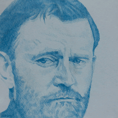
Grant through the years.
I’ve been listening to Ron Chernow’s epic biography of U.S. Grant on CD (38 CDs!). While listening, I drew these five portraits of the past President with a variety of pens from this set of plain ol’ Bic ballpoints.
The drawings were mounted on 8″ square wood panels and were displayed at the Sandzen Gallery holiday show.
Tuesday, August 6, 2019
Published!
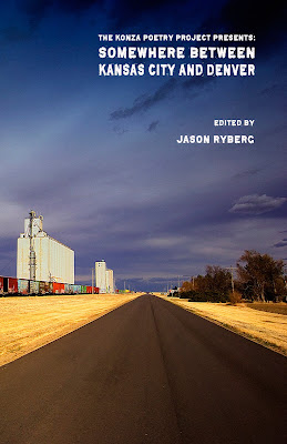 Thanks to Jason Ryberg of Spartan Press for including three pieces of my work in his new poetry anthology, Somewhere Between Kansas City and Denver.
There’s a book release party scheduled for August 22 from 6-9pm at SPARK in Downtown Salina. See more info about that here.
Thursday, March 26, 2015
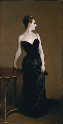
I was reminded of him in a roundabout way after listening to a story about Steve Mumford, an artist who documented the Iraq War with drawings and paintings. Mumford’s Baghdad Journals are a moving account of the time he spent there. He was inspired by Winslow Homer’s documentation of the American Civil War.
Hearing about Homer reminded me of John Singer Sargent’s work done after spending time at the Western Front in 1918. His large painting, Gassed, was completed during this time. Definitely a master.
Sunday, February 9, 2014
Friends, family, and fishing.
Thursday, January 9, 2014
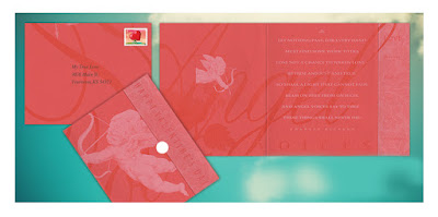
A Dickensian Valentine.
Here’s a self-mailing card (no envelope necessary, it comes with a round white sticker for closing) featuring original design and illustration to send to someone special.
The front of the card shows Cupid aiming his arrow, and the fold-over closing panel says ‘Happy Valentine’s Day.’ Inside Cupid appears again, and the panel on the right lists some qualities of love: patience, kindness, trust, hope, perseverance. Click on the image to see it enlarged.
The message is a lovely poem by Charles Dickens:
Let nothing pass, for every hand
Must find some work to do,
Lose not a chance to waken love —
Be firm and just and true.
So shall a light that cannot fade
Beam on thee from on high,
And angel voices say to thee —
These things shall never die.
A limited number are available. Let me know in the comments below if you're interested.
Thursday, April 11, 2013
Monday, April 8, 2013
Old bronze in gouache
Friday, April 5, 2013
Complex spices
This drawing was done in three sittings. It was still fun and gratifying to draw. I observed many things about my selection of spices that I didn't know before.
Friday, March 29, 2013
Thursday, March 28, 2013
Hand signals
According to Google, this mudra means teaching or instruction. I have another one -- which I might draw tomorrow -- means protection.
Monday, March 25, 2013
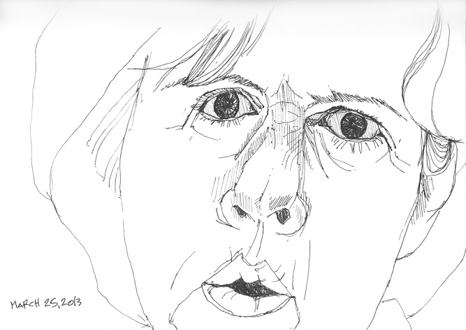
Fuzzy details
Sunday, March 24, 2013
Inspiration from the past


