Thursday, April 21, 2022

Watson & the Shark


I’ve mentioned my love for the painting Watson and the Shark by American painter John Singleton Copley several times. The romantic beauty of the pastel clouded sky paired with the sea foam green waves, creates a serene, dreamy feeling that contrasts with the heroic action at the center. There’s a lot to look at.

And then there’s the story behind the painting.


First, a little background: John Singleton Copley grew up on a Boston wharf in the mid-1700s. In his late teens, he became a popular portrait painter for wealthy American colonists, even painting the likes of Paul Revere and Samuel Adams. The political situation in Boston was growing increasingly turbulent, and Copley’s family connections were all Loyalists, so in 1774 he set sail for London. After embarking on a nine-month Grand Tour of Europe, he began his painting career again. In addition to portraits, Copley tried his hand at historical painting. His first foray into this genre was Watson and the Shark.

The subject of the painting, Brook Watson, was orphaned at six and sent to live with relatives on a Boston wharf, right next to the wharf where Copley’s family lived — they probably crossed paths. At age 14, he began working on a ship and sailed to Cuba. While swimming in Havana harbor one day, he was attacked by tiger sharks. It took three attempts to rescue him and he lost his leg in the attack.

Twenty-five years later, now a successful London merchant, Watson asked Copley to paint the scene. He apparently commissioned the painting as a lesson to others about overcoming adversity. He went on to become chairman of Lloyd’s of London, a Member of Parliament, and Lord Mayor of London.  (Not everyone admired his ambition; one writer noted, “there are those whose sympathy is with the shark.”)

Copley had never visited Cuba, so he probably got details of Havana harbor from prints and book illustrations. It’s obvious that he had never seen a shark: he painted the animal with lips and eyes that resemble a tiger’s more than a shark’s. Gory details of Watson’s injury are hidden beneath the waves, though a hint of blood is visible in the water. Many aspects of the painting appear to be influenced by what Copley saw on his Grand Tour a few years earlier.


One of the many interesting details of the painting is the Black sailor who watches over the violent scene. Copley’s first sketches were of a white man with long, flowing hair, but instead he used this character for the final painting. The same man, whose identity is unknown, appeared elsewhere in a standalone portrait by Copley. The painter seems to be making a connection between Watson, the very white, very vulnerable blond swimmer, and the Black man who is holding the rope that will save him.

The painting was exhibited at the Royal Academy in 1778, causing quite a sensation. It’s currently at the National Gallery of Art in Washington, D.C.

With Watson and the Shark, Copley created a dynamic and dramatic composition, and skillfully captured the varying human emotions. I can feel the fear, despair, and panic of the men on the boat, along with the strength and fierce determination of the young man standing at the front of the boat trying to fend off the shark. I never tire of looking at it.

Watson and the Shark was a blockbuster in its day, just like the movie Jaws was a few decades ago. Get a 'movie poster' featuring Brook Watson's shark attack here.

Friday, April 15, 2022

Botanicals, circuses, and Smithsonian classes.


An update on projects, products, and progress. There’s news about botanical watercolors, circus promotions, art history education, and more — see it here.

Wednesday, April 13, 2022

Marking an accomplishment.


I am now a proud graduate of the Smithsonian Associates World Art History program.🎓 To receive a certificate, completion of 4 core classes and 6 electives were required. The core classes took place in multiple sessions over the course of a month averaging 8 hours total, electives were 1-2 hours each. The classes were excellent and I recommend it for anyone interested in Art History. In past posts I’ve mentioned some of the classes, and here’s a list of my entire curriculum:

In-depth studies of works of art:

  • “The Death of Marat” by Jacques-Louis David
  • “Watson & the Shark” by John Singleton Copley (this is my favorite painting — so I made a shirt!)
  • “The Last Judgement” by Michelangelo
Specific periods in the lives of artists:
  • Jacques-Louis David and Napoleon
  • Michelangelo and the Medici Popes
  • Duccio and Giotto: The Dawn of Italian Painting
  • In the Footsteps of Piero della Francesca

General art/architecture:

  • Italian Architecture Through the Ages
  • Italian Renaissance Art
  • Drama Most Splendid: The Art & Architecture of the Baroque & Rococo
  • Enduring Themes in Western Art Part 1
  • Enduring Themes in Western Art Part II
  • Notre Dame: Reconstructing an Icon

This is the certificate they sent me. If you ever want to have a conversation about art history, just say the word! Read about all the Smithsonian programs here.


Tuesday, April 5, 2022

Projects, ideas, and news to share.


A new edition of the newsletter is out. There’s life drawing, CCR box set packaging, Earth Day stuff, and last chance for the Ukrainian shirts that benefit All Hands and Hearts charity. See the newsletter here. The Ukraine t-shirts are here.

Friday, March 25, 2022

More practice, less perfection.

The Bargue Drawings that I’ve done in our weekly group have been beneficial for developing ‘cold, hard accuracy’ (as one of our video instructors put it). I want to draw what I’m seeing, rather than what I think I’m seeing.

But recently we decided to venture into drawing from life instead of copying reproductions of lithographs. But finding models always seems to be a challenge. So we took the easy way out and used YouTube — who knew there were so many channels dedicated to life drawing!

We projected the videos onto a big screen, and instead of focusing on detailed accuracy, it was about capturing gesture with loose and immediate marks, in sessions from 1 minute to 30 minutes long. Totally different than Bargue Drawing, totally fun.

The image above shows a few of the life drawings I did in last week’s session, and below are some of the Bargue Drawings that I’ve completed so far (my copy on the left, originals on the right). 


Friday, March 11, 2022

Projects, ideas, and news worth sharing.

The March 11 edition of my newsletter is out, containing projects and interesting ideas to share, along with an opportunity to support the Ukraine people. See the newsletter here. The Ukraine t-shirts are here.


Friday, February 25, 2022

Projects, ideas, and news worth sharing.

The February 25 edition of my newsletter is out, containing projects and interesting ideas to share, along with a confession of theft! See it here.

Tuesday, January 25, 2022

Psyche loses her mind.

I had fun applying duotone and ‘glitch’ filters to one of my recent Bargue drawings, “Psyche of Naples.” The filters add visual interest to ordinary images, and make for an eye-catching poster or a coffee mug.

Thursday, January 20, 2022

Color that packs a punch.

‘Color packs a punch’ newsletter is out. Photoshop filter experiments, Bargue drawings, and Charles & Ray Eames. See it here.

Thursday, January 13, 2022

Highlights.

A friend recently admired a pair of earrings I was wearing, a gift from my daughter. I remembered that I had done a drawing of them a while back, and so went looking for it through the pages of stacks of sketchbooks. When I finally found it I was surprised at how much I liked it! It was done with a travel watercolor set, a water brush, black fineliners, and a Uni-ball Signo white gel pen. The drawing really came to life when the white highlights were added. The painted earrings are on the left, the actual earrings are on the right.

Wednesday, December 8, 2021

Sprinkle a little sunshine.


A local farmer’s market merchant needed a logo for her seed and nut mixture called Susie’s Sprinkles. Sue brought a lot of ideas to the table when we met. We brainstormed for a while, looking at various designs styles, typefaces, and color combinations. Then I went to work and created three unique looks for her company. She was particularly interested in the one that used the big monogram S, so that’s what we went with. After some back-and-forth with changes in color and details, here’s the result.

You can find Susie’s Sprinkles on Facebook.

Thursday, December 2, 2021

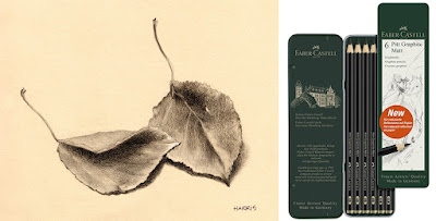
I love graphite — come matt or shine.

faber castell matt graphite pencils

A complaint I often hear about graphite is that you can’t get really dark darks without also getting shine. So I was eager to try the new Faber Castell matt graphite pencils.

I ordered the set of 12 (though I see now all Amazon has is a set of 6) which had from HB through 14B. The 14B got plenty dark, and there really ISN’T much of a shine. As the pencils progress in darkness, they increase in carbon content, rather than graphite. The carbon keeps them from producing a shine. You can see in my drawing of the leaves that the shadows are pretty dark, and there’s no shine. It also lifts up well with a kneaded eraser, as long as you haven’t been too heavy-handed when laying down the shadows. 

I’ve read mixed reviews from other people. To me, they handled a lot like Prismacolor pencils. Not a bad thing, but different from regular graphite. 

Friday, November 26, 2021

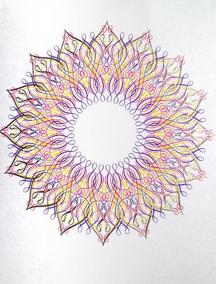
Marian Bantjes — contemporary designer/artist/letterer.

marian bantjes christmas card
Marian Bantjes is known for her obsessive patterning and ornament, whether hand-drawn or created digitally. This design was one of three holiday cards she did for Amorial Paris. It reminds me of how much fun I had with my Spirograph when I was a kid. But I never could keep my pen from jumping around the teeth of the plastic gears!

I bought Marian’s book, I Wonder, several years ago. It is a feast for the eyes, and also presents her ideas about the importance of the practical side of commercial projects, as opposed to the aesthetic qualities.

Tuesday, November 23, 2021

Hallmark & DalĂ®?

salvador dali christmas cards for hallmark

For Christmas 1960, Hallmark commissioned Salvador DalĂ­ to design some holiday greeting cards. It was an initiative led by Hallmark founder Joyce Clyde Hall to show the work of great artists to people who might not otherwise see it.

Dali asked for $15,000 in cash in advance for 10 card designs, specifying that he receive no input from Hallmark on subject or medium, no deadline, and no royalties. His designs included “Surrealist renditions of the Christmas tree and the Holy Family,” as well as a headless angel playing a lute, and the three wise men atop some wild-looking camels.

Hallmark only produced two of the designs, a nativity scene and a depiction of the Madonna and Child. Even those relatively tame images didn’t go over well, and negative public response soon convinced Hallmark to drop DalĂ­’s cards from their product line.

You might not be able to get Hallmark Christmas cards by DalĂ­, but you CAN get a DalĂ­ ornament made from Polish blown glass