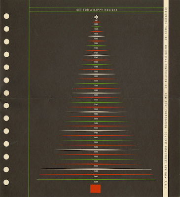
While designing Christmas cards for clients, I’ve been looking at past examples from some of my favorite designers/illustrators. Here’s a 1960s card from Milton Glaser (my all-time favorite), created for a typography company called Advertising Composition. He fashioned a Christmas tree from the type settings of its catalog. Anyone remember the days of type-specking?
BTW, Milton’s book Drawing is Thinking is an excellent ‘read’ (if you can call it ‘reading’) and demonstrates his idea that drawing is not just a way to represent reality, but a way to understand and experience the world.


No comments:
Post a Comment