

Tuesday, January 25, 2022
Psyche loses her mind.
Thursday, January 20, 2022
Color that packs a punch.
 ‘Color packs a punch’ newsletter is out. Photoshop filter experiments, Bargue drawings, and Charles & Ray Eames. See it here.
Thursday, January 13, 2022
Highlights.

Wednesday, December 8, 2021
Sprinkle a little sunshine.

A local farmer’s market merchant needed a logo for her seed and nut mixture called Susie’s Sprinkles. Sue brought a lot of ideas to the table when we met. We brainstormed for a while, looking at various designs styles, typefaces, and color combinations. Then I went to work and created three unique looks for her company. She was particularly interested in the one that used the big monogram S, so that’s what we went with. After some back-and-forth with changes in color and details, here’s the result.
You can find Susie’s Sprinkles on Facebook.
Thursday, December 2, 2021
I love graphite — come matt or shine.

A complaint I often hear about graphite is that you can’t get really dark darks without also getting shine. So I was eager to try the new Faber Castell matt graphite pencils.
I ordered the set of 12 (though I see now all Amazon has is a set of 6) which had from HB through 14B. The 14B got plenty dark, and there really ISN’T much of a shine. As the pencils progress in darkness, they increase in carbon content, rather than graphite. The carbon keeps them from producing a shine. You can see in my drawing of the leaves that the shadows are pretty dark, and there’s no shine. It also lifts up well with a kneaded eraser, as long as you haven’t been too heavy-handed when laying down the shadows.
I’ve read mixed reviews from other people. To me, they handled a lot like Prismacolor pencils. Not a bad thing, but different from regular graphite.
Friday, November 26, 2021
Marian Bantjes — contemporary designer/artist/letterer.

I bought Marian’s book, I Wonder, several years ago. It is a feast for the eyes, and also presents her ideas about the importance of the practical side of commercial projects, as opposed to the aesthetic qualities.
Tuesday, November 23, 2021
Hallmark & Dalî?

For Christmas 1960, Hallmark commissioned Salvador Dalí to design some holiday greeting cards. It was an initiative led by Hallmark founder Joyce Clyde Hall to show the work of great artists to people who might not otherwise see it.
Dali asked for $15,000 in cash in advance for 10 card designs, specifying that he receive no input from Hallmark on subject or medium, no deadline, and no royalties. His designs included “Surrealist renditions of the Christmas tree and the Holy Family,” as well as a headless angel playing a lute, and the three wise men atop some wild-looking camels.
Hallmark only produced two of the designs, a nativity scene and a depiction of the Madonna and Child. Even those relatively tame images didn’t go over well, and negative public response soon convinced Hallmark to drop Dalí’s cards from their product line.
You might not be able to get Hallmark Christmas cards by Dalí, but you CAN get a Dalí ornament made from Polish blown glass!
Alexander Girard — then and now.

Architect and designer Alexander Girard was extremely prolific during the 1960s and 1970s. I bet you’d recognize his work — take a look at this excellent video from a recent episode of CBS Sunday Morning (under 5 minutes long). This Christmas card an example of his skill with typography and lettering (his font, Sansusie, is one of my favs). He’s very much back in vogue: Girard’s family is reintroducing him to new generations with this website, House Industries is selling a wooden Alexander Girard Nativity based on his characters (update: nativity is no longer available), and there’s even an Alexander Girard coloring book!
Sunday, November 21, 2021
More holiday inspiration from great designers.

Continuing with the theme of classic holiday cards I found while looking for inspiration for my own clients’ projects this year, here’s one from Paul Rand designed in the 1960s. I wish I would have thought of this for an assignment when I was teaching commercial art: design a holiday card inspired by an indoor sport. Such a smart design!
Saturday, November 20, 2021
Holiday card inspiration from the greats.

While designing Christmas cards for clients, I’ve been looking at past examples from some of my favorite designers/illustrators. Here’s a 1960s card from Milton Glaser (my all-time favorite), created for a typography company called Advertising Composition. He fashioned a Christmas tree from the type settings of its catalog. Anyone remember the days of type-specking?
BTW, Milton’s book Drawing is Thinking is an excellent ‘read’ (if you can call it ‘reading’) and demonstrates his idea that drawing is not just a way to represent reality, but a way to understand and experience the world.
Friday, November 12, 2021
All roads lead to Rome.

I can’t resist posting this drawing of St. Peter’s Basilica in Rome from my sketchbook, because tomorrow is one of the last classes for my Smithsonian World Art History certificate and the subject is Italian architecture. I drew this during a previous Smithsonian class using Pigma Micron pens in a variety of sizes. These pens wear out kind of fast, but they’re waterproof so I can add color.
I wish I had drawn it from life, but alas, no.
Wednesday, November 10, 2021
A poppy for Veteran’s Day.
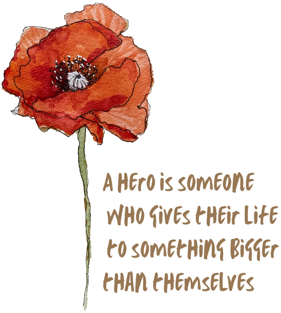
Tomorrow is Veteran’s Day, and we’ll probably see a lot of poppies as a symbol of remembrance. Here’s a little illustration of a poppy I did in my sketchbook a while back, and some info about how that tradition got started.
From The Poppy Story on the American Legion’s website: “After World War I, the poppy flourished in Europe. Scientists attributed the growth to soils in France and Belgium becoming enriched with lime from the rubble left by the war. From the dirt and mud grew a beautiful red poppy. The red poppy came to symbolize the bloodshed during battle following the publication of the wartime poem “In Flanders Fields.”
You can read more about The Poppy Story on the American Legion’s website, where you can also download a poster of “In Flanders Fields.” And here’s a sweatshirt featuring my illustration.
In Flanders Fields
By John McCrae
In Flanders fields the poppies blow
Between the crosses, row on row,
That mark our place; and in the sky
The larks, still bravely singing, fly
Scarce heard amid the guns below.
We are the Dead. Short days ago
We lived, felt dawn, saw sunset glow,
Loved and were loved, and now we lie,
In Flanders fields.
Take up our quarrel with the foe:
To you from failing hands we throw
The torch; be yours to hold it high.
If ye break faith with us who die
We shall not sleep, though poppies grow
In Flanders fields.
Unique holiday greetings make an impression!

Make this season even more special by sending custom holiday cards to your clients and customers. It’s a thoughtful way to let people know you value their business.
I’m currently finishing up several customized greetings cards and letters for clients, but I think there’s time to squeeze in at least a couple more!
Ready to get started or have questions? Just send me a message here.
Wishing you a happy holiday season!
Sunday, November 7, 2021
Art history.

Subscribe to:
Posts (Atom)